Understanding the Foundation of Great User Experience (UX)
At its core, user experience (UX) encompasses every aspect of a user’s interaction with a company, its services, and its products. When applied to websites, it’s about how a user feels when navigating your pages, consuming your content, or completing a specific task. While often confused with user interface (UI), which focuses on the aesthetic and interactive elements of a product, UX is a broader discipline. UI is a component of UX; a beautiful interface with poor usability will lead to frustration, not satisfaction.
The importance of UX cannot be overstated. In an era where users have countless options at their fingertips, a frustrating experience often leads to immediate abandonment. Think about it: if a website loads slowly, is difficult to navigate, or doesn’t provide the information a user seeks quickly, they will simply move on to a competitor. This translates directly into missed opportunities, higher bounce rates, and reduced conversions. A positive UX, on the other hand, fosters trust, encourages repeat visits, and can significantly boost your conversion rates, whether that’s signing up for a newsletter, downloading a whitepaper, or making a purchase.
Adopting a user-centric approach is fundamental to improving UX. This means placing the user at the very heart of your design and development process. It involves understanding their needs, behaviors, motivations, and pain points, and then designing solutions that address these effectively. This approach moves beyond making assumptions and instead relies on data, research, and continuous feedback loops. For startups especially, where resources might be tight, understanding this fundamental principle early on can save significant time and money by preventing the development of features or designs that users simply don’t want or need. It ensures that every decision made, from content strategy to button placement, is geared towards creating an intuitive, efficient, and enjoyable experience for your target audience.
Conducting User Research and Analysis for UX Improvement

You cannot improve what you don’t understand. The first tangible step in enhancing your website’s UX is to thoroughly understand your users. This starts with defining your target audience with precision. Who are they? What are their demographics, psychographics, online habits, and technological proficiency? Moving beyond broad categories, creating detailed user personas is incredibly valuable. A user persona is a semi-fictional representation of your ideal customer, based on real data and educated guesses about demographics, behavior patterns, motivations, and goals. For instance, “Marketing Manager Maria” might be 35, tech-savvy, uses LinkedIn daily, and is looking for efficient solutions to track campaign ROI.
Once you have personas, developing user journey maps helps visualize the entire process a user takes to achieve a goal on your website. This includes every touchpoint, action, thought, and emotion they might experience. Mapping these journeys reveals potential pain points, moments of delight, and critical junctures where the experience can be optimized.
To gather the necessary data for personas and journey maps, a variety of research tools and methodologies are available:
- Surveys and Questionnaires: These allow you to gather quantitative and qualitative feedback from a large number of users regarding their satisfaction, needs, and preferences.
- User Interviews: One-on-one conversations provide deep qualitative insights into user motivations, frustrations, and desires, offering context that surveys often miss.
- Usability Testing: Observing real users as they attempt to complete tasks on your website can reveal unforeseen issues in navigation, content clarity, and overall flow. This can be moderated (with a facilitator) or unmoderated (users complete tasks independently).
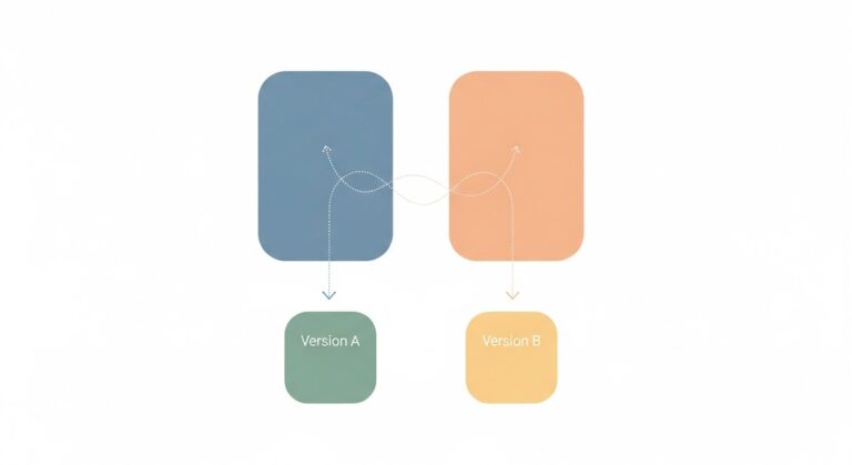
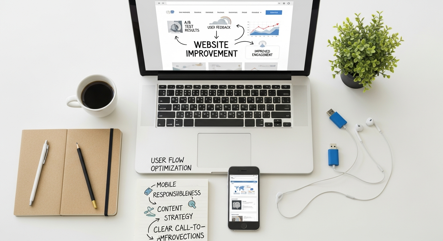
- A/B Testing (Split Testing): This powerful method involves presenting two different versions of a web page element (e.g., button color, headline, layout) to different segments of your audience and measuring which performs better against a specific goal (e.g., click-through rate, conversion). It’s an empirical way to make data-driven decisions on design choices.
- Card Sorting and Tree Testing: These techniques help understand how users categorize information, informing the optimal structure for your website’s navigation and information architecture.
Beyond direct user feedback, leveraging website analytics is crucial. Tools like Google Analytics provide invaluable data on user behavior, such as bounce rates, time on page, conversion paths, and popular content. By analyzing these metrics, you can identify pages with high exit rates, understand where users drop off in a conversion funnel, and pinpoint content that resonates most. Integrating heatmaps and session recordings takes this a step further, visually showing where users click, scroll, and spend their time on individual pages. Session recordings allow you to watch anonymized user sessions, providing a raw, unfiltered view of their interactions, revealing points of confusion or hesitation that might otherwise go unnoticed. This blend of qualitative and quantitative data forms the bedrock of truly effective UX improvements.
Crafting Intuitive Navigation and Information Architecture
Start with a clear site structure. This involves organizing your content into hierarchical categories and subcategories that make sense. Think of it like a well-organized library; books are grouped by genre, then author, then title. Similarly, your website’s content should flow from broad topics to specific details. Avoid overly deep navigation paths; generally, users should be able to reach any piece of content within 3-4 clicks.
Logical menu design is paramount. Your primary navigation menu should be easily discoverable and consistent across all pages. Use clear, concise labels that accurately describe the content they link to. Jargon and ambiguous terms are UX killers. Common menu patterns like horizontal navigation bars at the top, or hamburger menus for mobile, are familiar to users and reduce cognitive load. For larger sites, consider implementing mega-menus that display sub-categories directly, helping users scan and find what they need faster.
Enhance discoverability further with features like breadcrumbs and robust search functionality. Breadcrumbs (e.g., Home > Products > Software > Project Management) provide users with a clear path of where they are on your site and an easy way to navigate back up the hierarchy. A prominent and effective search bar is essential, especially for content-rich websites. Ensure your search function is intelligent, offering auto-suggestions, typo corrections, and relevant results. Users who resort to search often know what they want; make it easy for them to get it.
The ultimate goal is to minimize cognitive load. This refers to the amount of mental effort required to use your website. Overly complex layouts, too many choices, inconsistent design, or confusing language all increase cognitive load and lead to user frustration. Simplify where possible:
- Use clear headings and subheadings to break up content.
- Employ bullet points and numbered lists for scannability.
- Limit the number of navigation options on a single page.
- Ensure calls-to-action (CTAs) are distinct and unambiguous.
- Maintain consistency in design elements, terminology, and interaction patterns across your entire site.
By meticulously crafting your navigation and information architecture, you empower users to effortlessly explore your website, find value, and complete their objectives, thereby significantly boosting their overall experience.
Optimizing Website Performance and Responsiveness

In the digital age, speed is not just a feature; it’s a fundamental expectation. A slow-loading website is a major deterrent to a positive user experience and a significant hurdle for SEO. Studies consistently show that users expect pages to load within 2-3 seconds, and even a single second delay can lead to a substantial drop in page views, customer satisfaction, and conversions. For search engines like Google, page speed is a confirmed ranking factor, meaning a slow site won’t just frustrate users, it will also struggle to rank competitively.
To tackle slow loading times, several optimization techniques are critical:
- Image Optimization: Large, unoptimized images are a primary culprit for slow pages. Compress images without sacrificing quality, use modern formats like WebP, and implement lazy loading so images only load as they become visible in the user’s viewport.
- Browser Caching: Configure your server to enable browser caching, which stores static files (like images, CSS, and JavaScript) on a user’s local device. This significantly speeds up load times for repeat visitors.
- Content Delivery Network (CDN): A CDN distributes your website’s content across a network of servers globally. When a user accesses your site, content is delivered from the server geographically closest to them, reducing latency and improving speed.
- Minify CSS, JavaScript, and HTML: Removing unnecessary characters, whitespace, and comments from your code reduces file sizes, leading to faster download times.
- Server Response Time: Ensure your hosting provider offers excellent performance. A slow server can negate all other optimization efforts. Regularly review your server logs and consider upgrading if response times are consistently high.
Beyond speed, mobile-first design principles are non-negotiable in 2026. The vast majority of internet traffic now originates from mobile devices. Google’s mobile-first indexing means the mobile version of your site is the primary version used for indexing and ranking. A responsive website automatically adjusts its layout and content to fit various screen sizes, from desktops to tablets and smartphones, ensuring a consistent and optimal experience for all users.
Implementing mobile-first design involves:
- Starting your design process with the smallest screen size in mind, then progressively enhancing for larger screens.
- Using fluid grids and flexible images.
- Ensuring touch targets (buttons, links) are large enough to be easily tapped.
- Prioritizing essential content and functionality for mobile users.
- Optimizing forms for easy input on mobile devices.
Regularly testing across devices and browsers is crucial. Use developer tools, emulators, and actual physical devices to ensure your website renders correctly and functions seamlessly across the wide array of platforms your users might employ. This includes testing different operating systems (iOS, Android), browsers (Chrome, Firefox, Safari, Edge), and screen resolutions.
The choice of your tech stack profoundly impacts website performance and responsiveness. When considering What Is A Tech Stack How To Choose, prioritize technologies known for their efficiency, scalability, and robust support for modern web standards. For instance, a lightweight front-end framework combined with an optimized back-end language and a performant database can make a world of difference in your site’s speed and ability to handle traffic spikes. Conversely, a poorly chosen or overly complex tech stack can introduce bottlenecks that are incredibly difficult to resolve later.
Designing for Visual Appeal and Accessibility
While functionality is paramount, the visual design of your website plays a significant role in user perception and overall experience. A website that is aesthetically pleasing and professional instills trust and credibility.
Strive for a clean, consistent visual design. This means maintaining a unified look and feel across all pages:
- Typography: Choose legible fonts that are easy to read on various screen sizes. Limit yourself to 2-3 font families to maintain consistency. Ensure sufficient font size for body text (typically 16px or larger for readability).
- Color Schemes: Select a harmonious color palette that aligns with your brand identity. Use colors strategically to highlight important information, delineate sections, and guide the user’s eye. Ensure sufficient color contrast, especially for text, to meet accessibility standards.
- Whitespace: Don’t be afraid of empty space! Ample whitespace (or negative space) around elements prevents visual clutter, improves readability, and helps users focus on key content. It creates a sense of openness and sophistication.
Beyond aesthetics, accessibility is not just a legal requirement in many regions but a moral imperative and a smart business decision. An accessible website ensures that people with disabilities can perceive, understand, navigate, and interact with your site. This includes users with visual, auditory, motor, and cognitive impairments. Neglecting accessibility alienates a significant portion of the population and can lead to legal repercussions.
Adhering to Web Content Accessibility Guidelines (WCAG) is the industry standard for accessibility. Key considerations include:
- Alternative Text for Images: Provide descriptive
alttext for all images so screen readers can convey their meaning to visually impaired users. - Sufficient Color Contrast: Ensure there’s enough contrast between text and background colors. Tools are available to check WCAG compliance for color ratios.
- Keyboard Navigation: All interactive elements (links, buttons, form fields) must be operable using only a keyboard, without requiring a mouse. This is crucial for users with motor impairments or those who prefer keyboard navigation.
- Clear Focus Indicators: When navigating with a keyboard, a visible focus indicator (e.g., an outline around the active element) must be present to show users where they are on the page.
- Semantic HTML: Use HTML elements for their intended purpose (e.g.,
<h1>for main headings,<ul>for lists,<button>for buttons). This helps screen readers interpret the structure and meaning of your content. - Accessible Forms: Ensure form fields have clear labels associated with them, provide helpful error messages, and guide users through the submission process.
- Transcripts and Captions: For audio and video content, provide transcripts and closed captions to assist users with hearing impairments or those who prefer to consume content in text format.
Designing for accessibility benefits everyone, not just those with disabilities. Clear contrast benefits users in bright sunlight, keyboard navigation aids power users, and semantic HTML improves SEO. By integrating accessibility from the outset, you build a more robust, inclusive, and user-friendly website for all.
Engaging Content and Conversion Optimization
Even with stellar design and blazing-fast performance, your website won’t succeed without compelling content that resonates with your audience. Engaging content is a critical component of user experience, as it directly addresses user needs, builds trust, and guides them towards desired actions.
Focus on creating clear, concise, and valuable content. Users typically scan web pages rather than read every word. Therefore:
- Use strong, descriptive headings and subheadings to break up text and improve scannability.
- Employ short paragraphs, bullet points, and numbered lists to present information in an easily digestible format.
- Write in a simple, direct language, avoiding jargon where possible, unless your audience specifically expects it.
- Ensure your content directly answers user questions and provides solutions to their problems.
The quality of your content also ties directly into SEO. As we explore in our guide on How To Write Blog Posts That Rank Google, high-quality, valuable content that satisfies user intent is a primary factor for search engine ranking. When users find your content helpful and engaging, they spend more time on your site, share it, and return, signaling to search engines that your site is authoritative and relevant, which in turn boosts visibility.
Once users are engaged with your content, the next step is to guide them towards conversion. This is where well-placed and persuasive Calls-to-Action (CTAs) come into play. CTAs should be:
- Clear and Action-Oriented: Use verbs like “Download Now,” “Get a Free Quote,” “Start Your Trial,” or “Learn More.”
- Visually Prominent: Make CTAs stand out through color, size, and strategic placement, but avoid being overly aggressive or intrusive.
- Benefit-Driven: Instead of “Submit,” try “Get My Free Ebook” to highlight the value proposition.
- Contextually Relevant: Place CTAs where they make sense in the user’s journey, e.g., after explaining a product’s benefits or at the end of a valuable blog post.
For e-commerce sites or platforms requiring user input, optimizing forms and checkout processes is paramount. Long, complicated forms are a major point of friction. Minimize the number of fields, use clear labels, provide input masks (e.g., for phone numbers), and offer real-time validation to help users correct errors. For checkout flows, simplify the process, offer guest checkout options, display progress indicators, and clearly outline all costs upfront. Any unexpected hurdles can lead to cart abandonment.
Finally, consider the power of personalization. Tailoring content, recommendations, and offers based on a user’s past behavior, preferences, or demographic data can significantly enhance their experience and increase conversion rates. This could range from simple “Welcome back, [Name]” messages to dynamic content blocks that display relevant products or services. While implementing advanced personalization requires robust backend systems, even simple steps can make a user feel more valued and understood, fostering a deeper connection with your brand.
Iteration, Testing, and Continuous Improvement
Improving website user experience is not a one-time project; it’s an ongoing journey of iteration, testing, and refinement. The digital landscape is constantly evolving, user expectations shift, and your business goals may change. Therefore, treating UX as a continuous process is vital for sustained success.
The feedback loop is critical here. After implementing changes based on your initial research and design, it’s essential to measure their impact and gather new insights. This is where rigorous testing methodologies come into play:
- A/B Testing: As mentioned earlier, A/B testing (or split testing) allows you to compare two versions of a webpage or element to see which performs better. This is excellent for testing specific hypotheses, such as which headline generates more clicks, or which call-to-action button color leads to more conversions.
- Multivariate Testing (MVT): MVT is more complex than A/B testing, allowing you to test multiple variables on a single page simultaneously. For example, you could test different headlines, images, and CTA texts all at once to find the optimal combination. While more resource-intensive, MVT can uncover deeper insights into how different elements interact.
- Usability Testing (Ongoing): Periodically conducting usability tests with new users or testing new features ensures that your website remains intuitive and easy to use as it evolves. This can catch issues before they impact a larger audience.
- Analytics Monitoring: Continuously monitor your website analytics (bounce rate, time on page, conversion rates, exit pages) to identify trends, sudden drops, or improvements after changes are deployed. This quantitative data provides an objective view of user behavior.
- Heatmaps and Session Recordings: Regularly review updated heatmaps and session recordings to observe how users interact with new layouts, content, or features. These visual tools can highlight areas of confusion or delight.
Establishing effective user feedback loops is equally important. This goes beyond formal testing and includes:
- On-site Feedback Widgets: Simple tools that allow users to rate their experience or submit comments directly on a page.
- Surveys and Polls: Deploy short surveys at key points in the user journey (e.g., after a purchase, on exit intent) to gather specific feedback.
- Social Media Monitoring: Keep an eye on social media mentions and comments related to your website or brand for unsolicited user feedback.
- Customer Support Data: Analyze support tickets and common user complaints. These often highlight friction points in your website’s UX.
Managing this iterative process, especially for a tech startup with multiple ongoing projects, requires robust organizational capabilities. This is where leveraging the Best Project Management Software Startups can be incredibly beneficial. Tools like Asana, Trello, Jira, or Monday.com can help teams track UX research tasks, manage design sprints, coordinate A/B test deployments, and ensure that user feedback is systematically incorporated into future development cycles. They provide a centralized platform for communication, task assignment, and progress tracking, ensuring that UX improvements are not just ideas but actionable items that get prioritized and executed efficiently. By embracing this culture of continuous improvement, your website will remain competitive, user-friendly, and highly effective in achieving your business objectives in 2026 and beyond.
Frequently Asked Questions
Recommended Resources
Explore Accessibility In Ux Design Guide for additional insights.
Related reading: Best Email Management Tools 2026 (Bookmark Sharer).