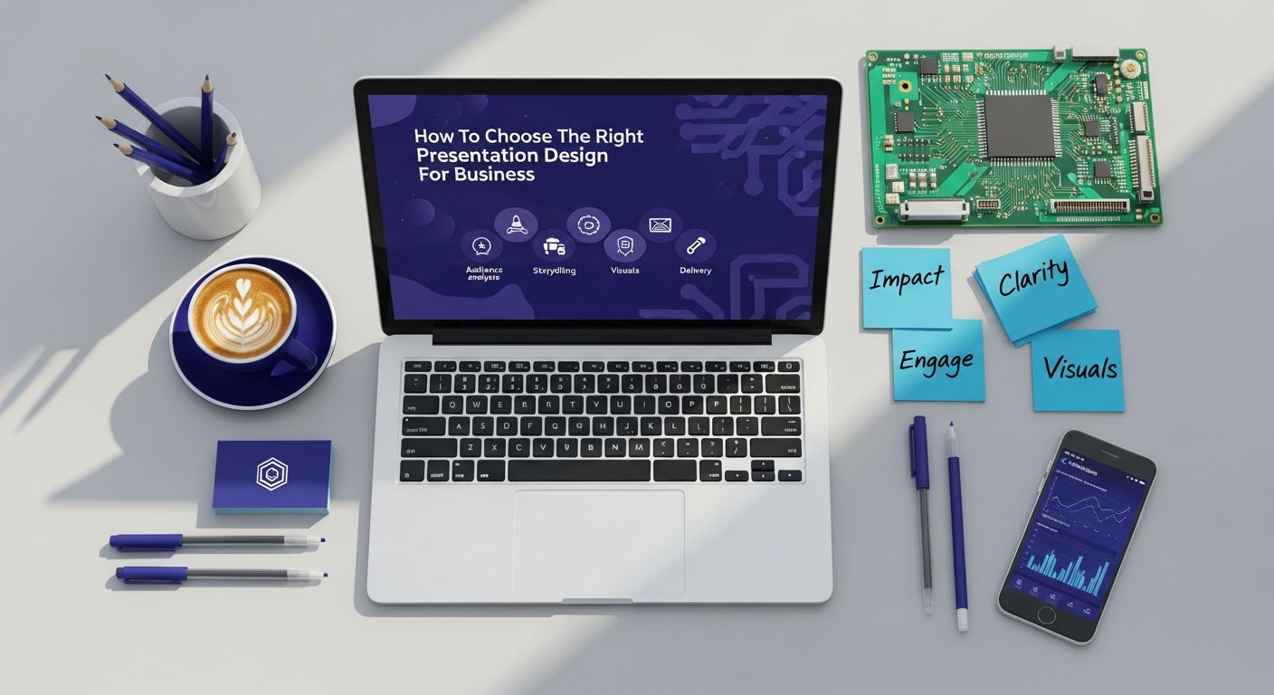
Understanding Your Audience and Objective: The Foundation of Design
Before a single slide is designed, the most crucial step is to deeply understand who you are speaking to and what you aim to achieve. Just as a successful Content Marketing Strategy hinges on audience insights, so too does an effective presentation. Without this clarity, even the most visually stunning slides can fall flat.
Defining Your Audience Demographics and Psychographics
Consider your audience as meticulously as you would when segmenting users for a new product launch. Are they potential investors, prospective clients, internal stakeholders, or industry peers? Their background, existing knowledge, pain points, and even their attention spans will dictate your design choices.
- Investors: They seek confidence, ROI potential, scalability, and a clear path to market dominance. Your design should be professional, data-rich but visually digestible, and reflect meticulous planning.
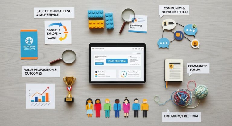
- Clients/Customers: They want solutions to their problems, tangible benefits, and ease of use. Focus on problem-solution, testimonials, and clear value propositions, much like a well-designed Landing Page That Converts.
- Internal Teams: They need clarity, motivation, and actionable insights. Designs can be more collaborative, engaging, and focused on operational efficiency or strategic alignment.
- Industry Peers: They appreciate innovation, thought leadership, and deep insights. Your design should be sophisticated, data-driven, and showcase original thinking.
Understanding their psychographics—their motivations, attitudes, and aspirations—allows you to tailor your visual language, tone, and the emotional resonance of your slides. A design that speaks directly to their intrinsic needs will always be more impactful.
Clarifying Your Presentation Goals: Inform, Persuade, Educate, or Entertain?
Every presentation must have a singular, overarching goal. This objective will serve as your North Star throughout the design process.
- To Inform: Presenting quarterly results, project updates, or market research. Design should prioritize clarity, data visualization, and logical flow.
- To Persuade: A pitch deck seeking investment, a sales presentation aiming for conversion, or a proposal for a new strategy. Design must build trust, highlight benefits, and guide the audience towards a specific call to action.
- To Educate: Training sessions, workshops, or explaining complex technical concepts. Design needs to simplify complexity, break down information into digestible chunks, and facilitate understanding and retention.
- To Entertain/Inspire: Keynote speeches, motivational talks, or brand storytelling. Design can be more evocative, visually rich, and focus on emotional connection and memorable imagery.
A clear objective not only shapes your content but also dictates your chosen color palette, typography, imagery, and even the pace and structure of your slides. It’s the strategic backbone that ensures your design choices are purposeful, not merely decorative.
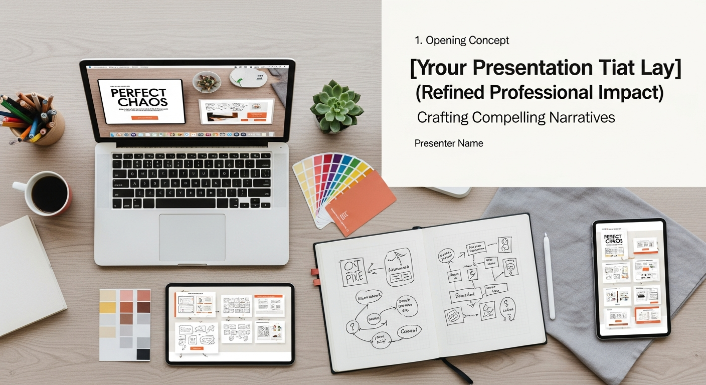
The Core Elements of Effective Presentation Design: Visuals, Text, and Branding
Once you understand your audience and objective, you can dive into the tangible elements of design. These components work in concert to create a cohesive and compelling narrative.
Visual Harmony: Graphics, Imagery, and Data Visualization
Visuals are the undisputed champions of engagement. In the digital age, audiences expect sophisticated and clear visual communication.
- High-Quality Imagery: Stock photos are acceptable, but custom graphics, illustrations, or professional photography can elevate your brand’s perceived value. Ensure images are relevant, high-resolution, and align with your brand’s aesthetic. Avoid generic, overused imagery that detracts from your professionalism.
- Consistent Iconography: Icons can convey complex ideas quickly and reduce text clutter. Use a consistent style throughout your presentation – either outline, filled, flat, or glyph.
- Powerful Data Visualization: For tech entrepreneurs, data is gold. But raw numbers are overwhelming. Transform data into compelling charts, graphs, and infographics.
- Choose the right chart type: bar charts for comparisons, line charts for trends, pie charts for proportions (sparingly), and scatter plots for relationships.
- Simplify: Remove unnecessary gridlines, labels, and 3D effects. Focus on the key takeaway.
- Highlight: Use color to draw attention to the most important data points or trends.
- Strategic Use of Video: Short, high-impact video clips can break monotony, explain complex processes, or showcase product demos effectively. Ensure they are embedded correctly and optimized for playback.
The goal is not to fill every inch of space, but to use visuals strategically to reinforce your message, make data understandable, and keep your audience captivated.
Textual Clarity: Typography, Brevity, and Readability
While visuals dominate, text remains critical for conveying specific details and reinforcing key messages. The way you present text significantly impacts its readability and your audience’s ability to absorb information.
- Typography Choices: Select fonts that are professional, legible, and align with your brand’s personality. Typically, use one or two complementary fonts: one for headings (often a sans-serif for modern appeal) and one for body text (can be sans-serif or a highly readable serif font).
- Legibility: Ensure fonts are large enough to be read comfortably from a distance (even in the back of a large room or on a small screen). A common rule of thumb is a minimum of 24pt for body text.
- Hierarchy: Use font size, weight (bold), and color to create a clear visual hierarchy, guiding the audience’s eye to the most important information first.
- Brevity is King: Presentations are not documents. Each slide should convey one core idea, supported by minimal text. Aim for the “6×6 rule” (no more than six lines of text, no more than six words per line), though this is a guideline, not a strict law. Use bullet points instead of paragraphs.
- Strategic Keyword Placement: Similar to SEO for your website content, strategically place keywords and key phrases within your slide titles and bullet points. This helps reinforce your core message and makes it easier for your audience to recall information.
Remember, your slides are a backdrop for you, the speaker. They should complement your narrative, not replace it.
Brand Consistency: Reflecting Your Identity
Your presentation is a direct extension of your brand. Maintaining consistency across all visual elements is crucial for building recognition, trust, and professionalism.
- Color Palette: Use your brand’s official color palette. These colors should be strategically applied to backgrounds, text, charts, and graphical elements. A consistent color scheme creates a cohesive and professional look.
- Logo Usage: Position your logo consistently on every slide, typically in a discreet corner. Ensure it’s not overly prominent or distracting.
- Brand Voice and Tone: The language used in your slides should mirror your brand’s voice – whether it’s innovative, authoritative, playful, or direct. This reinforces your brand identity beyond just visuals.
- Templates and Style Guides: Develop a master presentation template that incorporates all your brand guidelines. This ensures that anyone in your organization can create on-brand presentations, streamlining efforts and maintaining quality.
Just as a strong brand identity is vital for How to Improve Website UX, it’s equally important for your presentations. It creates a memorable experience and reinforces your company’s professionalism.
Choosing the Right Presentation Type and Software: Beyond Basic Slides
Common Presentation Formats and Their Applications
Not all presentations are created equal. Understanding the common types helps tailor your design.
- Pitch Decks: Concise, visually driven, and designed to secure funding. They often follow a specific narrative (problem, solution, market, team, ask) and demand a sleek, confident design.
- Sales Presentations: Focused on conversion, these highlight product benefits, demonstrate value, and address client pain points. They might be more interactive, allowing for customization during a live pitch.
- Webinars/Online Presentations: Designed for a remote audience, these require excellent screen readability, minimal distractions, and often incorporate interactive elements like polls or Q&A.
- Training & Educational Presentations: Emphasize clarity, modularity, and engagement to facilitate learning. They might incorporate quizzes, exercises, and detailed diagrams.
- Keynote Speeches: Highly visual, often with minimal text, focusing on storytelling and impactful imagery to inspire and engage a large audience.
Each format has specific design considerations. A pitch deck, for instance, needs to be compelling even when viewed asynchronously, while a sales presentation might be designed for dynamic speaker interaction.
Leveraging Modern Presentation Tools for Optimal Impact
The days of bland, text-heavy PowerPoint slides are long gone. Modern software offers sophisticated design capabilities and collaborative features.
- Microsoft PowerPoint & Apple Keynote: Still industry standards, offering robust features for complex presentations. They provide extensive customization, animation options, and integration with other Microsoft/Apple products. Keynote is often praised for its intuitive design interface and cinematic transitions.
- Google Slides: Excellent for collaboration, cloud-based access, and real-time editing. Its simpler interface makes it easy to use, though it might lack some of the advanced features of desktop software. Ideal for teams working remotely on shared presentations.
- Canva: A design powerhouse for non-designers. Offers a vast library of templates, stock photos, icons, and intuitive drag-and-drop functionality. Perfect for creating visually appealing presentations quickly, especially for Content Marketing Strategy assets.
- Prezi: Known for its non-linear, zoomable canvas, Prezi allows for dynamic storytelling and visual exploration of topics, breaking away from traditional slide-by-slide progression. It’s great for showing interconnected ideas.
- Beautiful.ai: An AI-powered design tool that automatically applies design best practices, ensuring your slides look professional with minimal effort. It helps maintain consistency and prevents common design mistakes.
- Custom Solutions/Web-Based Frameworks: For highly specialized needs (e.g., interactive data dashboards, immersive product tours), consider web-based frameworks like Reveal.js or custom-built interactive experiences.
The right tool empowers you to execute your design vision efficiently. Experiment with different platforms to find one that aligns with your team’s workflow and your presentation’s complexity.
Integrating Design with Your Broader Digital Strategy: SEO & UX Considerations

A powerful presentation doesn’t exist in a vacuum. It should be a synergistic component of your overall digital marketing and business development efforts. Strategic design ensures your presentation contributes to, rather than detracts from, your brand’s online presence and user experience.
Presentations as Part of Your Content Marketing Strategy
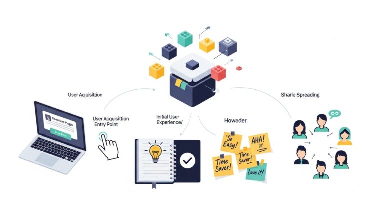
Think of your presentations as highly valuable pieces of content that can be repurposed and amplified across your digital channels.
- Lead Magnets: A well-designed presentation (e.g., a “how-to” guide, an industry report, or a detailed product overview) can be offered as a downloadable PDF on your website in exchange for an email address, serving as an effective lead magnet. This directly feeds into your Content Marketing Strategy.
- Webinar Content: Live webinars often use presentations as their core visual element. Recording and publishing these webinars (and their slides) on platforms like YouTube or your blog extends their reach and SEO value.
- SlideShare/Issuu Distribution: Uploading your presentations to platforms like SlideShare can increase your brand’s visibility, drive traffic back to your website, and establish thought leadership. Ensure your slides are self-explanatory enough to be understood without a speaker.
- Blog Posts & Infographics: Key takeaways, data visualizations, and compelling narratives from your presentation can be easily transformed into blog posts, articles, or static infographics, enriching your website’s content.
By integrating presentations into your content strategy, you maximize their value, reaching a wider audience and reinforcing your brand message consistently across multiple touchpoints.
Designing for Impact: Mirroring Landing Pages That Convert
There’s a significant overlap between designing an effective presentation and creating Landing Pages That Convert. Both aim to guide the user (audience) towards a specific action, and both rely on clear communication and compelling visuals.
- Clear Call to Action (CTA): Just as a landing page needs a prominent CTA, your presentation should conclude with a clear, concise, and compelling call to action. Whether it’s “Visit Our Website,” “Schedule a Demo,” “Invest Now,” or “Download Our Whitepaper,” make it impossible to miss.
- Visual Hierarchy: Both landing pages and presentations use visual hierarchy to draw attention to the most important elements. Headlines, subheadings, bullet points, and strategic use of negative space guide the eye.
- Benefit-Oriented Language: Focus on what your audience gains. Instead of listing features, articulate benefits. “Save 30% of your time” is more persuasive than “Automated workflow.”
- Social Proof & Trust Signals: Incorporate testimonials, client logos, awards, or statistics that build credibility, just as you would on a landing page to reassure potential customers.
By applying principles from high-converting landing pages to your presentation design, you create a more persuasive and action-oriented experience.
Enhancing User Experience (UX) within Presentations
The concept of User Experience isn’t confined to websites or apps; it’s paramount in presentations too. A good presentation UX ensures your audience remains engaged, understands your message, and feels satisfied with the experience. This aligns directly with principles of How to Improve Website UX.
- Logical Flow and Navigation: Your presentation should have a clear beginning, middle, and end. Use a consistent structure, clear section breaks, and potentially a ‘table of contents’ slide for longer presentations to help your audience orient themselves.
- Accessibility Considerations: Design with accessibility in mind. Use high-contrast colors, legible fonts, and consider providing alternative text descriptions for complex images if the presentation will be shared digitally. This ensures your message is accessible to everyone.
- Pacing and Timing: Avoid rushing through slides. Allow enough time for your audience to process information. A good UX considers the human cognitive load.
- Interactivity: Incorporate elements that encourage participation, such as polls, Q&A sessions, or even embedded interactive elements (if using advanced tools). This transforms a passive viewing experience into an active engagement.
- Minimal Cognitive Load: Don’t overload slides with too much information. Each slide should have a single, clear purpose. Use white space effectively to reduce visual clutter and help the audience focus.
A presentation with strong UX is intuitive, engaging, and leaves a lasting positive impression, much like a well-designed website.
Best Practices for Delivering and Refining Your Presentation: Beyond the Slides
Even the most impeccably designed slides need a compelling delivery and a continuous refinement process to reach their full potential. The design itself is only half the battle; how it’s brought to life is equally important.
Storytelling through Design
Humans are hardwired for stories. A great presentation isn’t just a series of facts; it’s a narrative that takes your audience on a journey.
- The Hero’s Journey: Frame your audience as the hero, your product/solution as the guide, and the problem you solve as the dragon.
- Emotional Arc: Start with a compelling hook, build tension by illustrating the problem, introduce your solution as the climax, and conclude with a vision of the future.
- Visual Storytelling: Use imagery and graphics to advance your narrative. A sequence of images can tell a story more powerfully than paragraphs of text.
- Consistency in Narrative: Ensure your design elements (colors, fonts, imagery) support the emotional and logical flow of your story.
Design can amplify your story, making it more vivid, memorable, and emotionally resonant.
The Power of Simplicity and White Space
In design, less is often more. Simplicity is not the absence of complexity, but the mastery of it.
- Declutter: Remove any elements that don’t directly contribute to your message. Every visual and textual element should have a purpose.
- Embrace White Space (Negative Space): This isn’t empty space; it’s design space. White space allows elements to breathe, improves readability, and draws the eye to key information. It makes your presentation feel sophisticated and professional.
- Focus on One Idea Per Slide: This prevents cognitive overload and ensures your audience can easily grasp the core message of each slide.
A simple, clean design communicates confidence and clarity, preventing your audience from feeling overwhelmed.
Feedback, Iteration, and Analytics
No presentation is perfect on the first try. Just like product development or optimizing Landing Pages That Convert, iteration is key.
- Seek Diverse Feedback: Get input from colleagues, mentors, and even target audience members. Ask specific questions: Is the message clear? Are the visuals engaging? Is the CTA compelling?
- Practice and Refine: Rehearse your presentation multiple times. Pay attention to timing, transitions, and how you interact with your slides. Identify areas where the flow feels clunky or the message is unclear.
- Analyze Performance (Post-Presentation): If your presentation is part of a larger campaign (e.g., a webinar, an online pitch), analyze metrics like engagement rates, conversion rates from your CTA, and audience feedback. This data is invaluable for refining future presentations.
Treat your presentation design as an ongoing project, constantly seeking opportunities to improve its effectiveness and impact.
Future-Proofing Your Presentation Strategy for 2026 and Beyond: Trends and Innovation
The landscape of communication is ever-evolving. To stay ahead, tech entrepreneurs must anticipate and integrate emerging trends in presentation design. Looking towards 2026, several innovations are set to reshape how we present.
Interactive Elements and Immersive Experiences
Static slides are giving way to dynamic, interactive experiences that truly engage the audience.
- Augmented Reality (AR) & Virtual Reality (VR): Imagine presenting a new product concept where the audience can virtually interact with a 3D model, or experiencing a virtual tour of a proposed architectural design. AR/VR will move beyond niche applications into mainstream presentations for immersive storytelling and product demonstrations.
- Clickable Prototypes & Live Demos: Instead of screenshots, presentations will increasingly embed live, clickable prototypes of software or website interfaces, allowing for real-time interaction and demonstration of functionality. This is particularly powerful for showcasing How to Improve Website UX features directly within the presentation.
- Personalized Pathways: Advanced presentation tools will allow for adaptive content delivery, where the speaker can dynamically adjust the presentation flow based on audience responses or real-time queries, creating a personalized experience for each group.
These interactive elements will transform presentations from passive viewing to active participation, leading to deeper understanding and greater impact.
AI-Powered Design Tools
Artificial intelligence is already revolutionizing design, and its influence on presentations will only grow stronger by 2026.
- Automated Slide Generation: AI can analyze your content, identify key themes, and automatically suggest layouts, imagery, and even generate entire slides that adhere to design best practices and your brand guidelines. Tools like Beautiful.ai are just the beginning.
- Content Optimization: AI will assist in optimizing text for brevity and clarity, suggesting alternative phrasing, and ensuring consistency in tone and style.
- Audience Engagement Prediction: AI-powered analytics could predict audience engagement levels for different slide types or content segments, allowing presenters to refine their approach pre-delivery.
- Dynamic Data Visualization: AI will be able to interpret complex datasets and automatically generate the most appropriate and visually compelling charts and graphs, tailored to your specific message.
AI will become an indispensable co-pilot for presentation designers, freeing up time for strategic thinking and creative storytelling.
Remote-First Presentation Design
The shift to remote work has cemented the importance of designing presentations specifically for digital delivery and consumption.
- Optimized for Screen Sharing: Designs must prioritize readability on various screen sizes and resolutions. High contrast, larger fonts, and minimal clutter are paramount.
- Engagement Features: Built-in polls, Q&A functions, and virtual whiteboards within presentation platforms will become standard, facilitating real-time interaction in virtual environments.
- Asynchronous Consumption: Presentations designed to be viewed independently (e.g., downloadable reports, video recordings with voiceovers) will need to be self-explanatory and compelling without a live speaker. This reinforces the need for strong visual storytelling and clear calls to action, much like effective Landing Pages That Convert.
- Hybrid Event Adaptability: Presentations will need to seamlessly adapt between live in-person delivery and simultaneous virtual broadcasting, requiring flexible layouts and dual-purpose design considerations.
Designing with a remote-first mindset ensures your message transcends geographical boundaries and remains effective in an increasingly distributed business world.
Choosing the right presentation design for your business is a strategic endeavor that merges art with science. By understanding your audience and objective, mastering core design elements, leveraging appropriate tools, integrating with your broader digital strategy, and embracing future trends, tech entrepreneurs can create presentations that not only communicate but truly captivate, persuade, and drive success. In a competitive landscape, a well-designed presentation isn’t just an advantage; it’s a necessity for thriving in 2026 and beyond.
Frequently Asked Questions
Recommended Resources
For more on tips and tricks, see How To Use Chatgpt For Productivity At Work on Bookmark Sharer.
Related reading: Graphic Design Principles For Beginners (Layout Scene).