html
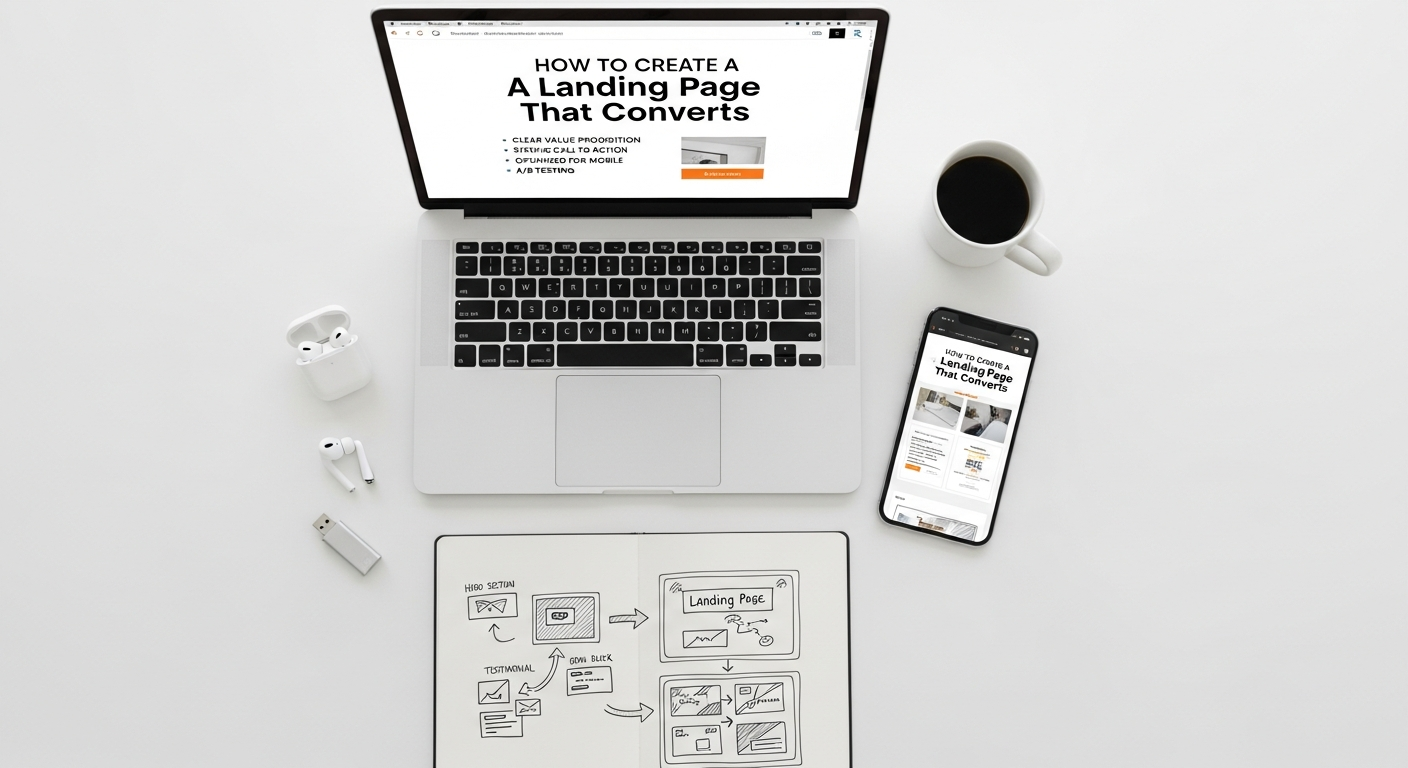
In the dynamic landscape of digital marketing and tech startups, a landing page isn’t just a web page; it’s a critical conversion engine. It’s the dedicated destination for your marketing campaigns, designed with a singular purpose: to prompt a visitor to take a specific action. Whether that’s signing up for a newsletter, downloading an e-book, requesting a demo, or making a purchase, a high-converting landing page is the linchpin of successful online growth. For businesses striving to capture leads and drive revenue in 2026 and beyond, understanding the science and art behind creating these powerful pages is non-negotiable. This comprehensive guide from Eamped will walk you through every essential step, from foundational principles to advanced optimization techniques, ensuring your landing pages don’t just exist, but truly excel.
Understanding the Core Anatomy of a High-Converting Landing Page
Before diving into the intricate details of design and copy, it’s crucial to grasp the fundamental elements that define a successful landing page. Think of it as constructing a compelling narrative, where each component plays a vital role in guiding your visitor towards conversion. A well-structured landing page acts as a focused salesperson, addressing visitor needs, building trust, and making an irresistible offer.
- Singular Focus: The One Goal Rule
Unlike a typical website with multiple navigation options, a landing page has one, and only one, primary objective. Every element – from the headline to the call-to-action (CTA) – must serve this single purpose. Eliminating distractions is paramount. This means no external navigation menus, no links to other parts of your website (unless they are absolutely critical for conversion, like a privacy policy), and a clear, unambiguous value proposition.
- Targeted Audience and Offer Alignment
A high-converting landing page speaks directly to a specific audience segment with a highly relevant offer. This means understanding your ideal customer’s pain points, desires, and motivations. The more tailored your message and offer are to the specific traffic source (e.g., an ad click, an email link), the higher your conversion rates will be. Generic pages yield generic results. Consider the journey your potential customer has taken to arrive at your page; your content should seamlessly continue that narrative.
- Clarity and Conciseness
In a world saturated with information, visitors have short attention spans. Your landing page must communicate its value proposition and required action clearly and quickly. Avoid jargon, overly complex sentences, and unnecessary information. Every word and image should contribute to the conversion goal. Speed of comprehension is directly correlated with conversion rates.
- Trust and Credibility Signals
People convert when they trust you. This is especially true for burgeoning tech startups. Incorporate elements that build confidence and validate your offering. These can include customer testimonials, trust badges (e.g., security seals, industry awards), social proof (e.g., “Used by 10,000+ businesses”), case studies, and clear privacy policies. For those exploring the Best Project Management Software Startups, for instance, seeing their logos on a landing page can significantly boost credibility.
- Mobile Responsiveness
A significant portion of web traffic now comes from mobile devices. Your landing page absolutely must be fully responsive, offering an optimal viewing and interaction experience across all screen sizes. A clunky mobile experience is a guaranteed conversion killer. Test rigorously on various devices to ensure functionality and aesthetics are maintained.
Crafting Compelling Copy: The Art of Persuasion
Words are the engine of persuasion on your landing page. Effective copy doesn’t just inform; it connects, convinces, and compels action. Every piece of text, from the headline to the CTA button, must be meticulously crafted to guide the visitor through a psychological journey that culminates in conversion.
The Power of Your Headline
- Grab Attention Instantly: Your headline is the first thing visitors see and often the deciding factor in whether they stay or bounce. It must be clear, concise, and immediately convey your core value proposition.
- Highlight a Benefit, Not a Feature: Instead of “Our software has X features,” try “Achieve Y result with our software.” Focus on what the user gains.
- Use Strong, Action-Oriented Language: Words like “Discover,” “Unlock,” “Transform,” “Boost” can be highly effective.
- Incorporate Keywords (Naturally): While SEO is a secondary concern for landing pages compared to core website pages, using relevant keywords from your traffic source (e.g., your ad copy) ensures message match and reinforces relevance.
Subheadings and Body Copy: Guiding the Narrative
- Break Down Information: Use subheadings to make your content scannable. Visitors often skim before they read in detail. Subheadings should act as mini-headlines, summarizing the key benefit of each section.
- Focus on Benefits and Solutions: Elaborate on the benefits introduced in your headline. How does your product or service solve the visitor’s problem? Use bullet points for readability and to highlight key advantages.
- Address Objections: Anticipate common doubts or questions your audience might have and subtly address them within your copy or a dedicated FAQ section (often placed lower on the page).
- Maintain a Consistent Tone: Ensure your copy aligns with your brand voice and the expectations set by the ad or link that brought the visitor to the page.
- Keep it Concise: While you need to provide enough information to convince, avoid excessive verbiage. Every sentence should earn its place.
The Call-to-Action (CTA): The Conversion Catalyst
- Be Clear and Action-Oriented: Your CTA button text should explicitly state what the user will get or do. “Download Your Free E-book,” “Get Started Now,” “Request a Demo,” “Sign Up for Updates.” Avoid vague terms like “Submit” or “Click Here.”
- Create Urgency or Scarcity (When Appropriate): Phrases like “Limited Time Offer,” “Join 20,000+ Users Today,” or “Only X Spots Left” can motivate immediate action.
- Make it Visually Prominent: Your CTA button should stand out through its color, size, and placement. It should be easily discoverable above the fold and potentially repeated further down the page.
- Consider Microcopy: Small bits of text near the CTA (e.g., “No credit card required,” “Cancel anytime”) can alleviate user anxiety and boost conversions.
Designing for Conversion: Visuals, Layout, and User Experience
Beyond compelling words, the visual presentation and overall user experience of your landing page are paramount. Design isn’t just about aesthetics; it’s a strategic tool that directs attention, builds trust, and simplifies the conversion process.
Strategic Layout and Visual Hierarchy
- Above the Fold Focus: The most critical information (headline, primary image/video, and sometimes the CTA or lead form) should be visible without scrolling. This immediate clarity sets the stage for engagement.
- F-Pattern or Z-Pattern Layout: Research suggests users often scan pages in an F-pattern (across the top, down the left side, across again) or Z-pattern (across the top, diagonally down, across the bottom). Design your elements to align with these natural scanning behaviors, placing key information along these paths.
- Whitespace is Your Friend: Don’t cram too much information onto the page. Ample whitespace improves readability, reduces cognitive load, and helps elements stand out.
- Visual Cues and Directional Guiding: Use arrows, lines, or even images of people looking towards your CTA or form to subtly direct the user’s eye towards the conversion goal.
Images, Video, and Multimedia
- High-Quality, Relevant Visuals: Use professional, engaging images or videos that directly relate to your offer and resonate with your target audience. Avoid generic stock photos. Show your product in action, happy customers, or illustrative graphics.
- Hero Shot: A prominent image or video that visually represents your product, service, or the benefit it provides. This should be high-impact and immediately convey value.
- Short Explainer Videos: For complex offerings, a concise video can be far more effective than text in explaining benefits and demonstrating functionality. Keep it under 90 seconds.
- Optimize for Load Speed: Large, unoptimized images or videos can drastically slow down your page, leading to high bounce rates. Compress images without sacrificing quality and use efficient video hosting.
Forms: The Gateway to Conversion
- Minimal Fields: Ask for only the absolutely necessary information. Every additional field decreases conversion rates. Can you get by with just an email address? Start there.
- Clear Labeling: Ensure form field labels are clear and concise. Placeholder text can assist but should not replace labels.
- Single-Column Layout: Research shows single-column forms are easier to complete than multi-column layouts.
- Validation and Error Messages: Provide real-time validation and clear, helpful error messages if a user makes a mistake. This reduces frustration and improves completion rates.
- Privacy Assurance: Reassure users about how their data will be used, perhaps with a small line of text like “We respect your privacy. Your information will never be shared.”
The Technical Backbone: Choosing Your Landing Page Tech Stack

Behind every high-performing landing page is a robust and well-integrated technical infrastructure. Choosing the right tools and platforms is crucial for efficient development, deployment, and ongoing optimization. This involves understanding What Is A Tech Stack How To Choose for your specific needs, considering scalability, ease of use, and integration capabilities.
Landing Page Builders and Platforms
- Dedicated Landing Page Software: Tools like Unbounce, Leadpages, Instapage, or ClickFunnels are specifically designed for creating high-converting landing pages. They offer drag-and-drop interfaces, A/B testing capabilities, and robust analytics, often requiring minimal coding knowledge.
- Website Builders with Landing Page Functionality: Platforms like HubSpot, WordPress (with plugins like Elementor or SeedProd), or Wix/Squarespace offer varying degrees of landing page creation functionality. They can be good if you need to integrate closely with your existing website or CRM.
- Custom Development: For highly unique designs or complex integrations, custom coding might be necessary. This offers maximum flexibility but requires significant development resources.
CRM and Marketing Automation Integration
- Seamless Lead Capture: Your landing page should seamlessly integrate with your Customer Relationship Management (CRM) system (e.g., Salesforce, HubSpot CRM, Zoho CRM). This ensures that every lead captured is immediately funneled into your sales pipeline for follow-up.
- Automated Follow-Up: Integration with marketing automation platforms (e.g., Mailchimp, ActiveCampaign, Pardot) allows you to trigger automated email sequences based on conversion, nurturing leads further down the funnel.
- Data Synchronization: Ensure data collected on your landing page accurately maps to fields in your CRM and marketing automation tools, preventing data silos and ensuring a unified customer view.
Analytics and Tracking
- Google Analytics: Essential for tracking page views, bounce rates, time on page, traffic sources, and user behavior. Set up conversion goals to measure success accurately.
- Heatmaps and Session Recordings: Tools like Hotjar or Crazy Egg provide visual insights into how users interact with your page – where they click, scroll, and if they encounter any usability issues. This qualitative data is invaluable for optimization.
- Tag Manager: Google Tag Manager (GTM) simplifies the process of adding and managing tracking codes (e.g., Google Analytics, Facebook Pixel, ad platform conversion tags) without needing to modify the page’s code directly.
Security and Compliance
- SSL Certificate: Ensure your landing page uses HTTPS. This encrypts data transmitted between the user and your server, building trust and protecting sensitive information, especially if you’re collecting personal data.
- GDPR/CCPA Compliance: If you’re collecting data from users in regions with strict privacy regulations, ensure your forms and privacy policies are compliant.
Driving Traffic and Optimizing for Success
Building a perfect landing page is only half the battle; you need to drive qualified traffic to it and continuously optimize for better performance. This iterative process of testing, analyzing, and refining is what separates good landing pages from truly exceptional ones.
Traffic Generation Strategies
- Paid Advertising (PPC): What Is Pay Per Click Advertising? It’s a highly effective way to drive targeted traffic to your landing page. Platforms like Google Ads, Facebook Ads, LinkedIn Ads, and TikTok Ads allow you to pinpoint your audience with precision. Ensure your ad copy and keywords perfectly align with your landing page’s message for maximum ad relevance and Quality Score.
- Email Marketing: Leverage your existing email list by sending targeted campaigns that direct subscribers to relevant landing pages. Segmentation ensures your offer resonates with specific groups.
- Social Media Marketing: Organic and paid posts on platforms like Instagram, Twitter, and LinkedIn can drive traffic. Use engaging visuals and compelling calls to action in your posts.
- Content Marketing/SEO: While landing pages are typically for direct conversion, related blog posts or content can serve as entry points, linking to a relevant landing page for those ready to convert.
- Affiliate Marketing: Partner with affiliates who can promote your offer and drive traffic to your landing page in exchange for a commission.
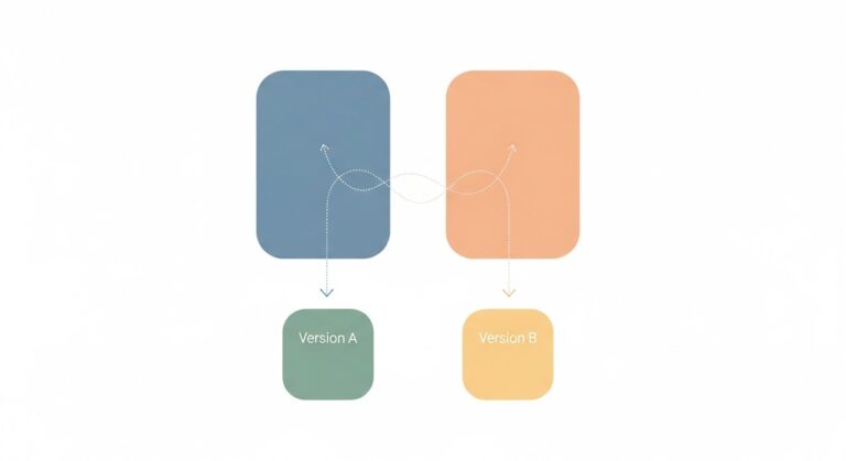
A/B Testing: The Engine of Optimization
- Test One Element at a Time: To accurately attribute changes in conversion rates, only modify one element per A/B test (e.g., headline, CTA button color, image, form field).
- Formulate Hypotheses: Don’t just test randomly. Based on data or intuition, form a hypothesis about why a change might improve conversions (e.g., “Changing the CTA button from blue to orange will increase clicks because orange stands out more”).
- Ensure Statistical Significance: Run tests long enough to gather sufficient data and achieve statistical significance before declaring a winner. Tools will usually tell you when this is reached.
- What to Test:
- Headlines and subheadings
- Call-to-action (text, color, size, placement)
- Images vs. videos
- Form length and field types
- Page layout and element placement
- Offer variations (e.g., “Free Trial” vs. “Demo”)
- Testimonials and social proof placement
Continuous Monitoring and Iteration
- Regularly Review Analytics: Don’t just set and forget. Consistently monitor your landing page performance using Google Analytics and your chosen platform’s built-in reports. Look for trends, drop-off points, and unexpected behaviors.
- Gather User Feedback: Consider implementing surveys (on-page or post-conversion) or conducting user interviews to understand qualitative feedback about your landing page experience.
- Stay Updated: The digital marketing landscape evolves rapidly. Keep an eye on industry best practices, new design trends, and emerging technologies that could enhance your landing page performance in 2026 and beyond.
Beyond the Build: Managing and Scaling Your Landing Page Strategy
Creating a single high-converting landing page is a great start, but true success comes from managing a comprehensive landing page strategy that scales with your business. This involves robust project management, team collaboration, and a long-term vision for optimization.
Project Management for Landing Page Campaigns
- Define Clear Objectives and KPIs: For each campaign, establish specific, measurable, achievable, relevant, and time-bound (SMART) goals and Key Performance Indicators (KPIs). What’s the target conversion rate? How many leads do you need?
- Utilize Project Management Software: Managing multiple landing pages, A/B tests, and content updates can quickly become complex. Leveraging tools from the Best Project Management Software Startups (like Asana, Trello, Monday.com, or ClickUp) can help organize tasks, assign responsibilities, track progress, and ensure deadlines are met for content creation, design, development, and testing.
- Establish a Workflow: Create a defined process for landing page creation, review, launch, and optimization. This ensures consistency and efficiency, especially as your team grows.
Team Collaboration and Roles
- Cross-Functional Teams: Successful landing pages often require input from various departments: marketing (strategy, copy), design (visuals, UX), development (technical implementation, integration), and sales (lead qualification criteria, follow-up).
- Clear Communication Channels: Ensure all team members are aligned on goals, progress, and feedback. Regular sync-ups and shared documentation are crucial.
- Designated Ownership: Assign a clear owner for each landing page and overall campaign to ensure accountability and consistent oversight.
Scaling Your Landing Page Efforts
- Template Libraries: Develop a library of proven landing page templates that can be easily customized for new campaigns, saving time and ensuring brand consistency.
- Personalization: As your data capabilities grow, explore dynamic content and personalization. Show different headlines, offers, or images based on the user’s location, referral source, or past interactions.
- Segmented Landing Pages: Instead of one generic landing page, create multiple highly specific pages tailored to different audience segments or traffic sources. This dramatically improves message match and conversion rates.
- Documentation and Knowledge Base: Document best practices, successful test results, and common pitfalls. This institutional knowledge is invaluable for training new team members and maintaining high standards.
Frequently Asked Questions About Landing Page Conversion
What is the ideal length for a landing page?
There’s no single “ideal” length; it largely depends on the complexity of your offer and the amount of information required to convince a visitor. For simple offers (e.g., email signup), a short, concise page above the fold is often best. For more complex products or high-ticket items (e.g., B2B software, expensive courses), a longer page with more detailed explanations, testimonials, and FAQs might be necessary to address all potential objections. The key is to provide enough information to facilitate a decision without overwhelming the user. Test different lengths to see what resonates best with your audience.
How often should I A/B test my landing pages?
A/B testing should be an ongoing, continuous process. You should constantly be looking for ways to improve your conversion rates. Start by testing the most impactful elements (headline, CTA). Once those are optimized, move to smaller details. Even small percentage gains can lead to significant revenue increases over time. The frequency depends on your traffic volume; you need enough traffic to achieve statistical significance for each test. If you have high traffic, you can test more frequently.
What are common reasons for a low-converting landing page?
Low conversion rates often stem from a few common issues: poor message match (the ad/link doesn’t align with the page content), unclear value proposition, distractions (too many links or navigation options), a weak or ambiguous call-to-action, too many form fields, slow load times, lack of trust signals, or a non-responsive design. Analyzing your page with heatmaps and session recordings can often reveal user experience issues that contribute to low conversion.
Should I remove navigation from my landing page?
Yes, in most cases, you absolutely should remove your main website navigation. The primary goal of a landing page is to drive a single conversion. Navigation links serve as distractions, offering visitors an easy escape route before they’ve had a chance to engage with your offer. By eliminating navigation, you create a focused environment that guides the user towards your desired action, significantly improving conversion potential.
What is the role of social proof on a landing page?
Social proof is incredibly powerful because it leverages the psychological principle that people are more likely to trust and adopt something if others are already doing so. On a landing page, social proof (like testimonials, customer logos, star ratings, or mentions of user numbers) builds credibility and reduces perceived risk. It assures new visitors that your offer is legitimate, valued by others, and worth their time or investment, making them more comfortable converting.
How do I measure the success of my landing page?
The primary metric for success is the conversion rate: the percentage of visitors who complete your desired action. Beyond this, you should track: bounce rate (how many leave immediately), time on page (indicating engagement), traffic sources (to understand what drives qualified visitors), and cost per conversion (especially for paid traffic). Integrating your landing page with tools like Google Analytics and your CRM allows for comprehensive tracking and attribution, providing a clear picture of your ROI.
Recommended Resources
Explore Sketch App Guide For Ui Designers for additional insights.
Check out How To Avoid Burnout Working Remotely on Bookmark Sharer for a deeper dive.